It
was a balmy coastal evening. The sun set on a warmly humid day with
an unusual lack of drama. The pale yellow, lemon horizon faded into
grim, darkening black with an uneventful, unremarkable, fuzzy ease.
The entrance into the Abedian School of Architecture now has a
certain familiarity about it that seems to have the same lack of
impact as the evening sky on days like this. Yet, still there was a
surprise. The linear easel structure remained in place, looking
larger than ever, crudely, awkwardly, filling the corridor in a way
that was previously concealed by the intimacy of the entry screen,
now removed, and the crowds, now gone – see:
http://voussoirs.blogspot.com.au/2017/12/abedian-school-of-architecture-spring.html
; and the bar had been brought forward to avoid the awkward crush at
the kitchen/entry space. It was, apparently, the barman's decision.
He seemed to miss the irony of the comment that architects should
know better. With so many architects about, why does it take a barman
to notice the better location for the distribution of drinks? But
this is the Abedian School where architecture seems to be defined by
the visual drama of its own building, the ‘Sir Peter’
architectural form that becomes the promotional front for the working
sheds behind – see:
http://voussoirs.blogspot.com.au/2017/12/abedian-school-of-architecture-spring.html
Appearances seem to be more important than functions in this visual
drama of vertical posts, curving masses and dramatic downpipes: see -
http://voussoirs.blogspot.com.au/2013/11/bond-downpipes.html
Strangely,
there were many folk already seated with a drink in the Forum area.
Students? Were they all encouraged to attend; coerced? What was the
particular draw-card tonight – the speaker; the drinks; the
nibblies: all three? One picked up a glass of wine from the more
welcoming bar location, bypassed the cheese and bikkies, and chose a
seat. The electronics at the lectern were just being connected. There
is always some exemplary exposition of hope on these occasions with
last-minute setups – blind belief that the gadgets will work
without any testing failures. One attended to the few matters that
needed to be looked at on the mobile phone, like everyone else. The
tap on the back meant that a colleague had arrived – late. It was a
steaming, solar hot water unit that had been the problem: 6:29pm.
Unusually,
the speaker was ushered in by Professor Adrian Carter, like a formal
promenade at a wedding without the fanfare. He introduced her in
glowing terms; they were obviously good friends: “has won domestic
awards; completed an apartment block at 3565 Main Beach, the new
benchmark; has been written about in Chasing the Sky – 20
Stories of Women in Architecture (by Dean Dewhirst).” Virginia
Kerridge, (VK), had been invited to run a masters programme at the
school. She began, gushing with praise for it: “One big happy
family in this beautiful building.” One remains cynical about such
relationships generating exuberant praise. Opinions must be better
than a mate’s vision of things. The school inspections of the past
come to mind, where mate invited mate in a reciprocal dance of
self-indulgent praise to ensure the very best of reports.
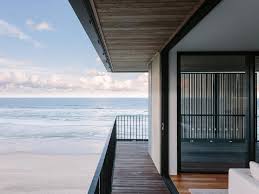
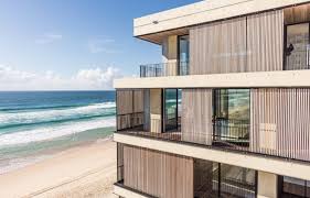
Main Beach apartments
Andy Goldsworthy's art - as delicate and amazing as Scarpa's detailing
VK –
see: http://vk.com.au/ - dedicated
her talk titled Art & Craft in Architecture, to the late
Paul Pholeros, who had been the director of Healthabitat.^ She began
by introducing her ideas: how architecture was “an art and a craft;
art plus human experience” - “the interaction of looking and
feeling and habitation.” VK’s mother was an artist. VK told how
she had been raised with great artists, (Dobell, Boyd, etc.), as
household names – mother was a student at the College of Art in
Sydney. Then a friend’s artworks in nature were illustrated. There
were beautifully delicate “interventions” that brought to mind
the wonderful work of the Scottish artist, Andy Goldsworthy, but his
name was not mentioned: the work was identical in its ideas, themes
and techniques. It was this artwork that first raised the words
tactility and
materiality,
and the concept of “making
an intervention in a site.” The suggestion, the implication, seemed
to be that all of these people and environments had had an impact on
VK – inspired her, even if latently. Scarpa was added to the list;
his Castelvecchio Museum that displayed “an intervention in a
building, to integrate and be a part of it,” was mentioned.** The
phrases started: “sense of tactility; getting ideas together” in
the details of rails, steps, windows. Switzerland’s Peter Zumpthor
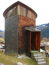
got a brief mention, with an image of this Saint Benedict Chapel
flashed up on the screen; but little more was said about this
architect’s work beyond its “great sense of wonder in
landscape.”# It seemed more intricate and considered than this – see text on
Zumpthor below.
Castelvecchio Museum, Scarpa
VK
became a little nostalgic as she told of her beginnings at the NSW
University where she studied architecture somewhat reluctantly,
almost belligerently. It was only some time later that she “became
really passionate about architecture,” after travelling to New
York. It was then that she started working for herself. The stories
went on to tell about 2008, when Katie Page – see:
https://en.wikipedia.org/wiki/Katie_Page
- commissioned VK to develop a site at Main Beach. It was an area
zoned for three storeys only, but the team wanted seven - “ to
still maintain contact with street.” This seemed to set a terrible
example for less responsible developers who might not care about the
street. Ideas included “interface with public; green areas;
screening; transparency and privacy; building depth; open/closed
spaces.” It seemed strange to hear the 1970’s theory on the 'public space/street supervision' concept, then known as Safe
Spaces, being promoted as a new, twenty-first century vision.
This was the 3565 Main beach apartment building the Professor had
praised. One remembered that the ‘relationship with the street’
concept arose as an important issue because mothers in high-rise
units in Britain felt the need to be able to supervise their children
in the play areas. Why was it important here when screens seemed to be the main expression?
An
abundance of drawings was shown to illustrate the development of this
project, and many models too. The architect had to go to court to
argue for its approval. Sand-coloured, smooth concrete, grey zinc and
pre-aged, recycled ironbark, (from the Kingaroy Railway), had been
used for the building materials to create a “transitional urban
form” for this seven storey building – “actually eight if you
count the penthouse,” which, of course, one should. This game
seemed to be as tricky as that of any other developer. Ideas of
“modulation; light; human scale; relation to beach; transparency,
(“Sort of see through them”),” were raised as the slick,
double-light, John Gollings’ images glossed over the screen. The
photographs captured the unique glory of the building as a sculpture:
“It was a big effort; took ten years”: (on architectural photography: see -
and
http://voussoirs.blogspot.com.au/2017/12/solitary-architecture-ignoring-contexts.html )
and
http://voussoirs.blogspot.com.au/2017/12/solitary-architecture-ignoring-contexts.html )
3565 Main Beach
House in the Country
House in the Country - showing historic cottage
VK
moved on to talk about the House in the Country (the Hunter
region). It was actually houses on a horse stud in a remote valley in
the Hunter region: “I really love horses; such intelligent,
sensitive creatures.” The approach to the design started with
wandering around the site, “the valley of the gods.” She, VK,
wanted to “keep the sense of history.” This seemed to be the two
old sandstone cottages said to be a bushranger retreat,
Thunderbolt’s hideout. The ideas continued: “ look at mountains;
engage with creek, (reshaped by Peter Andrews, a quirky
environmentalist promoted by Gerry Harvey of Harvey Norman); follow presence of
mountains; scale; honour the mountains.” A couple vet houses were built
first, almost as a test case, both saluting the hills; and then the main residence that
incorporated the old sandstone buildings was constructed, to give “solid and
transparent” spaces; “places for pauses” to “accentuate
transparency,” all on the 100 year flood level datum, at a “grand
scale.” The “idea of grafting;” of “adding to old as though
it had always been there” - “a light touch with everything on the
property.” Was this simply another version of Murcutt’s “touch
the ground lightly” rephrased? The “sense of materiality and
tactility that we are keen on using” was noted, along with the
“robust materials inside” - hardwood ply and rammed earth: but
not too much rammed earth, “It was far too expensive.” The
influence of Scarpa was noted in the detail, “in all things you
touch.” “The roofs echo the mountains behind.” One thought of
the 1960s classic book by Paul Grillo, What is design?
Is it ever read these days?
Is it still in print? One
wonders about the negative impacts of ‘progress' that mock age and its intelligence and relevance.
House in the Country
House in the Country - 'robust materials inside'
Zumpthor-esque verticals
House in the Country - 'valley of the gods'
House in the Country - vet's residence 'salute'
Taylor Square Warehouse - 'lead roof used to add weight':
note the classic 'architect's' car carefully parked for the image:
knowing some photographer's tricks, one needs to ask - what might it conceal?
Taylor Square Warehouse - 'a piece of sculpture'
VK moved on to talk about the Taylor Square Warehouse, the
refurbishment of the old carriage works building to become a home. VK
noted that the ideas were the same: “robust materials; light;
recycled materials - (“This is where I start being interested in
textures”) - detailing; inside/outside.” Oddly, lead was used as
the roofing material - “To add weight to the scheme.” Was this a metaphor or a functional fact? Here VK
explained that her art was always rooted in her constant potting,
painting and sketching, suggesting that this involvement freed up her
architectural efforts. “The quality of work goes down when one
stops revitalising your work.” The “higgedly-piggedly” stair
was pointed out, “a piece of sculpture.” “Certain things are a
constant patter – the importance of detail; tactility; “What is a
handle?” - the shape of the hands.” (see:
http://voussoirs.blogspot.com.au/2014/03/what-is-handle.html
) “Exercise bespoke tactility; part of a vocabulary of a building;
the enjoyment of materiality.” The repeated words started to feel
like bland architectural jargon - (see:
http://voussoirs.blogspot.com.au/2018/01/architectural-words-logic-and-meaning.html
).
The lovely sag of the 'weighty' lead roof:
note the panel accommodates the perforations of the tapware, but not the waste
Taylor Square Warehouse 'Scarpa-esque' detail:
it seems to lack the intrigue, surprise and wonder of Scarpa's work
Luker Studio in Glebe was the next project to be revealed.
This was spoken about only briefly. It was from a stage where VK
“just did things” - (c.f.
http://voussoirs.blogspot.com.au/2016/11/drew-heath-bespoke-details-practise.html
). She had it photographed only recently for the talk. Here an
original, historic, Edmund Grouse house had been extended. The
intentions were not to spoil the place with a “deliberate
intervention, modern and robust,” to create a studio for the client
in a garden – a box within a box. VK “played around with form”
that “just happened,” to give “a multifunction box in a
garden.” It all appeared somewhat random and ad hoc.
Luker Studio - 'deliberate intervention'
Luker Studio - 'modern and robust'
Bronte House was the next project up on the screen, a house
for VK’s brother just above Bronte Beach - “floating platforms
with screens for privacy.” We had heard about this theme before.
“The pond defines entry; play with textures, (much like a Scarpa
water detail); an enriching experience at the entry; void for airflow
over dining area; sense of transparency and light (“my
obsession”).”
The problems in controlling the service connections!
Bronte house - dining ventilation void
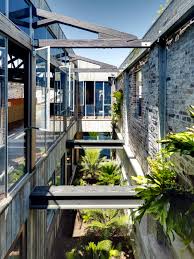
The Lilyfield Warehouse for Merrick Watts, a comedian was
spoken about: “always fun.” “Wanted to have the character of a
family home.” VK spoke of how parts of the old warehouse were
removed to open up courtyard garden spaces, leaving the old trusses
in place as “memory.” The issues were “air flow; robust
materials; recycling of materials; re-imagining the building;
obsession with tactility; relation to human scale” - “that’s
what my work is saying to me.” It is what we had heard frequently
repeated throughout the evening.
That
was the end of the talk that
finished bluntly,
in a way similar to that used by the traditional storyteller: “That
is the end of the story” -
“That is my last image:” It was 7:40pm. This was obviously
too early for Professor Adrian, who moved in with an exotically
florid summing up: " a painterly approach to architecture;
sympathetic recycling, etc. . . ." He asked a couple of ‘Dorothy
Dix’ questions, as if to extend the evening; but even these
self-conscious acts did not fill the gap, so questions were begged
from the audience. Was he aiming for 8:00pm as the invitation had
defined it? One person responded to the call: “Where do you get
your inspiration for your buildings?” was the student's sad
question. One thought: not from Pinterest! One could only admire the
measured response to this naive question from what looked like a lost
soul; how it was carefully and sensitively managed. It was indeed an
impossible question to answer, one that said more about the student, and perhaps the
school, than anything else.* Tradition explains the situation in a
matter-of-fact manner: if it could be told, it would have been –
such is the quality of matters subtle and poetic.
Still
the time-gap had to be filled. Professor Adrian moved in with a
commentary-question so forced that it felt embarrassing: “Do what
is appropriate; full site engagement; vocabulary of how to look at
problems; learn from material and inspiration.” It felt like a real
struggle. This too, was responded to with guile and awareness. Then
there was still more begging for more questions; even comments would
do now. One audience member responded with questions about the legal
approval process of the Main Beach apartment block. This project had
to go to court to obtain approval. A few more minutes were spent
exploring an answer, “that it was all happy endings; fluidity of
bedroom spaces; screens help external appearance; protect outside to
give more life inside; a double layer.” Then, yet again, there was
more begging and explanations: “inside/outside space; treated as a
big house; 100 signatures against; didn’t conform to codes; now
liked by all.” “A change of thinking in the area?” “Yeah,
probably a change in street landscape.” Professor Adrian was
obviously searching for his prediction to be confirmed – that this apartment block
was the new benchmark: (see real estate NOTE below).
Castelvecchio Museum, Detail, Scarpa
Now,
in spite of the continued begging, there were no more questions, just
a persistent, eerie silence. The subdued "OK" seemed to
admit defeat. "Thank you." It was 7:45pm.
Castelvecchio Museum, Detail, Scarpa
The
question remains: if Scarpa is such an influence, does the quality of
the outcome lie in reproducing his awareness and solutions, or in seeking out the
substance, the roots of his awareness? One had the feeling that
this lady was designing a 'Scarpa' response to architectural matters.
This seemed only to give things ‘Scarpa-esque.’ If quality and
depth are going to resonate, rather than be replicated in an attempted reproduction, one has to
seek feelings and emotions deeper than appearances, techniques, and
themes. One kept on seeing Scarpa things in this work, almost in the
same way as one might read a catalogue. The constant repetition of
materiality, tactility and transparency – “my obsessions” –
appeared to modify the commitment, and turn it into a prescription.
Scarpa's work always holds more than a reproduction or a replica in approach can; more than a self-conscious 'careful
feeling' might induce, no matter how 'sensitive' or 'committed' this act is seen to be, or be
explained.
The
inspiration derived from other architects is always a concern. How
many Ronchamps are there throughout the world? I can think of a pump
house, a transport rest area building, and a residence, all of which have been shaped
with the very best intentions of ‘worshipping’ Ronchamp. All make
a mockery of it, in spite of these ambitions arising from sincere, respectful
admiration. We need to manage our inspiration as well as our
intentions. It is easy for one to squash the other. One inspired
detail does not make a work of art: but the role of copying in
tradition needs to be acknowledged – see writings of Ananda
Coomaraswamy. It was always considered better to copy a master than
invent some quirky, personal variation of one’s own ad hoc invention.
VK’s
talk was shaped by words that appeared to touch on a limited, fixed set of understandings that perhaps could manage futures - contain them. Yet the ‘art
&craft’ of the architecture did manage to be displayed. It
shows how tradition’s understanding of copying values, as against
the circumstance where one “just did things .. playing around with
forms . . . just happened,” still has relevance and strength even
today. Good work can be done without being just too ‘arty’ or
‘crafty.’ We need to overcome the desire for everything to be a
bespoke creation of MY unique genius, and approach the world with
sensitivity and care; and humility – see comment below.*
^
Paul Pholeros director of Healthabitat: see -
https://en.wikipedia.org/wiki/Paul_Pholeros
see also:
How design can help fight poverty - https://www.youtube.com/watch?v=aiDSQyFdd68
see also:
How design can help fight poverty - https://www.youtube.com/watch?v=aiDSQyFdd68
#
Peter Zumpthor: VK did not dwell too long on identifying the PZ Saint
Benedict Chapel, located in the village of Sumvitg, Graubűnden.
Was it because one might recognise the similarity between its idea
and the housing at Hunter?
*
Perhaps VK could have referred to PZ’s approach:
In
an interview with The New York Times, Zumpthor once explained
his process: “When I start, my first idea for a building is with
the material. I believe architecture is about that. It’s not about
paper, it’s not about forms. It’s about space and material.”
(www.archdaily.com)
Maybe
VK should have simply noted Scarpa and Zumpthor as her inspiration,
as she had explained in her talk; but perhaps this might have alerted
folk to the parallels between their work and hers: note the structure
of the Hunter Houses, its similarity to Zumpthor’s chapel. Note
also the similarity between the specific details that can be said to
be 'Scarpa-esque.' ‘Inspiration’ can so easily be seen as
copying. Now this raises yet another issue : today it is seen as a
weakness to copy; that one has not been ‘original.’ Tradition
held that it was always better to copy than to probe blindly into the
discovery of form ‘creatively,’ 'higgedly-piggedly,' not really knowing what one was doing, just hoping for an 'interesting' outcome.
Copying at least gave one a direction that held or referenced meaning, rather than one's indulging in random games, the 'playing around with form' seeking ‘self- expression.’ Art in older eras was never
self-expression. It represented subjects that had depth and meaning,
cosmic relevance. It was this understanding that made copying
important, that it reproduced things of substance rather than mere personal whims. Our era seeks the scattergun approach: the repeated revelations of creative genius in everyone seeking to declare ME!
Maybe
the poet can help here?
C.K.Stead
Collected Poems 1951-2006, AUP, 2008, p.286:
‘Thinking
is what creeps up on me
when
I’m not thinking.
It’s
the living that matters.’
**
Note: Dropped names are used in the talk, apparently for the sustenance
and prestige that might come with them, but not much more. The
significant Peter Zumpthor barely got a mention, but became a claimed
reference. Scarpa was mentioned two or three times. It was good to see that the consultants in the projects were given credit for their involvement.
Saint Benedict Chapel, Zumpthor
Hunter House, VK
Saint Benedict Chapel, Zumpthor
Hunter House, VK
Hunter House, VK
Saint Benedict Chapel, Zumpthor
Saint Benedict Chapel, Zumpthor
Saint Benedict Chapel, Zumpthor
CARLO SCARPA DETAILS
NOTE
Zumpthor and Scarpa are two of nine famous architects who never had a degree: see -
Educational institutions might find this simple fact worth pondering. The list is:
Frank Lloyd Wright
Louis Sullivan
Le Corbusier
Mies van der Rohe
Buckminster Fuller
Luis Barragán
Carlo Scarpa
Tadao Ando
Peter Zumpthor
Le Corbusier
Mies van der Rohe
Buckminster Fuller
Luis Barragán
Carlo Scarpa
Tadao Ando
Peter Zumpthor
NOTE:
For 3565 Main Beach ‘real world’ real estate information, see:
https://www.realestate.com.au/property/3565-main-beach-pde-main-beach-qld-4217
and
One
has to be puzzled about the dedication of this talk to Paul Pholeros
given his commitment to design that can help fight poverty (see
above).
24 OCTOBER 2019
TWINS
The invitation from
the Abedian School of Architecture at Bond University arrived as an
E-mail. Julie Eizenberg of KoningEizenberg was going to talk. The
link in the text was clicked in order to seek out more information;
the work was perused. The ‘Kerridge’ touch was recognised: the
‘Edison/Swan’ factor?
INVITATION
TO ATTEND:
ABEDIAN SCHOOL OF ARCHITECTURE #7
ABEDIAN SCHOOL OF ARCHITECTURE #7
JULIE
EIZENBERG,
KONING
EIZENBERG ARCHITECTURE
Los Angeles
Los Angeles
sponsored by
Wilson Architects
DATE
Thursday, 17 October 2019
TIME
Refreshments from 6pm for a 6.30 start
VENUE
Abedian School of Architecture, Bond University
Thursday, 17 October 2019
TIME
Refreshments from 6pm for a 6.30 start
VENUE
Abedian School of Architecture, Bond University
JULIE
EIZENBERG OF: KoningEizenberg
Julie
Eizenberg, FAIA, RAIA, LFRAIA, Founding Principal has given
visibility to the design value and potential of community projects in
a people-oriented practice. Her focus on the user experience, whether
of an individual, community, or the public at large brings an
empathetic perspective that underpins how the firm transforms mundane
programs into places of ease and generosity. Julie teaches around the
world, and has been a frequent advisor to the U.S. Mayor’s
Institute on City Design and outspoken advocate on the value of
social impact design. She is a board member of Public Architecture,
the School of Architecture at Taliesin and FYI Films.
NOTE
7 November 2019


No comments:
Post a Comment
Note: only a member of this blog may post a comment.