The 2018 catalogue
of the Swell Sculpture Festival held at Currumbin Beach, Queensland,
Australia has been published here to illustrate the review and
commentary of this event: see -
http://voussoirs.blogspot.com/2018/09/swell-sculpture-festival-2018-artful.html
This allows all
sculptures to be illustrated and all texts associated with each work
to be included in order to cover the broad scope of this outdoor
exhibition as compactly and completely as possible.
The SWELL LIST 2018
below gives a brief commentary on each work.
SWELL CATALOGUE 2018
SWELL CATALOGUE 2018


SWELL LIST 2018
Comments have been jotted down on each work by way of a general overview, and to assist in the reassessment of the works with time. One's opinions do change, but they need substance to ponder, to assess and to challenge ideas and thoughts, to give something tangible to stimulate debate. First thoughts can be wrong: well, different to later ones; challenged by them, perhaps.
Comments have been jotted down on each work by way of a general overview, and to assist in the reassessment of the works with time. One's opinions do change, but they need substance to ponder, to assess and to challenge ideas and thoughts, to give something tangible to stimulate debate. First thoughts can be wrong: well, different to later ones; challenged by them, perhaps.
01 Glen Manning &
Cathy Daly, QLD CONTINUUM
This frame is
strangely albino by day, but colourful by night, in spite of the
illustration in the catalogue. This confuses the observer who becomes
distracted by the additional puzzle layered on to this enigmatic maze
of pipes.
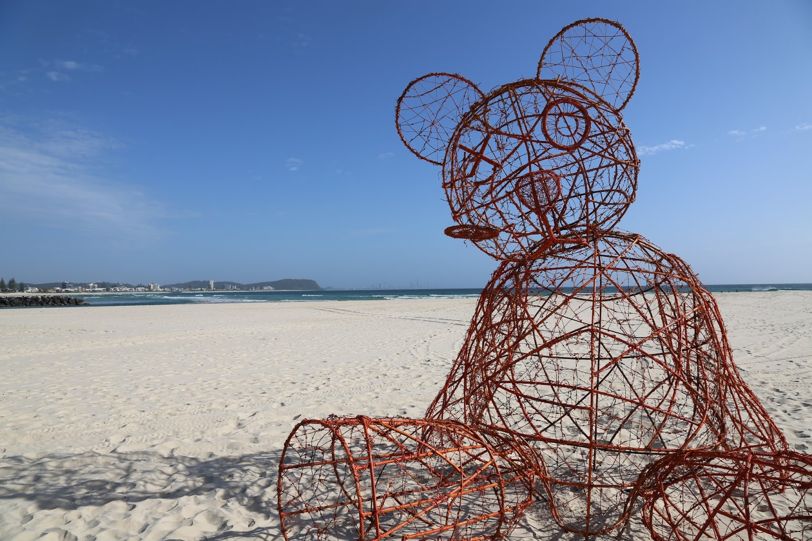
02 Dion Parker &
Andrew Cullen, QLD PRICKLES THE UNHUGALBE BEAR
(surely they
meant UNHUGGABLE?)
One might have hoped
the spelling could have been correct – or is this an artistic
liberty? Apologies for not recognising this cleverness, but what does
it mean? The concept is intellectual, and lacks cohesive strength in
expression beyond its scale. The story of this barbed wire
entanglement made into a teddy bear is cute, but it leaves one
pondering rather than feeling, experiencing loss or concern about
change.
03 Karl Myer,
SA FOCI
This is a most
beautifully crafted work. It can be admired on many levels, other
than the one described: a place of contemplation. It seems too
worryingly saw-tooth for relaxed reverie. It is a shame because this
work is convincing in its stamina. It could easily be seen holding
pride of place in a corporate lobby, as a form inspired by nature.
The lighting made the work that held strength by day, a wonder by
night.
04 Nick Warfield,
NSW DINGO
A beautiful idea
that struggles to embody its potential depth. It is difficult to
express such intense sensibility with a careful clutter of pieces.
Sadly, the lighting of this piece was truly terrible.
05 Elizabeth
Poole, QLD REBIRTH, BLOOMING YELLOW WAVE/MEDAL BLOOMS
It is difficult to
get excited about an old, reworked idea that really does not have
much prominence by day. It has some pretty shadows; and the night
lighting of a few parts did have some interesting textures and
colours. A ‘return to a celebration’ is difficult to achieve with
the original energy and intensity.
06 Phillip &
Alex Piperides, QLD CURRUMBIN ROCK – BOY
At least this work
had a simple and modest rationale. It looked wonderful on the rock,
full of the interest and enthusiasm of youth. It truly captured the
innocence of exploration – children playing on the beach on a day
out from the suburbs of Brisbane. It is an experience understood by
many. Sadly the black blob in the catalogue gives no true sense of
what the work is. It is also a shame that sculpture 07 is projected
over the same rock as thought the ‘boys’ were not there.
07 Glenn Barry &
Brian Keayes, QLD LIGHT ROCK
This is an
interesting light work. It does change the emphasis of SWELL, making
it a light display at night. The work is only a series of strange ‘T’
poles during the day. It rudely projects over sculpture 06, using the
same rock. One might have thought that each work might have
recognised the other, or have been separated. Still, it was one of
the more intriguing works.
08 Stanislav
Roudavoski, VIC THE HEX
A beautiful work
that leaves one wanting to look more. The mathematical form is
beautiful, purely fractal. Was this piece too ephemeral to be a
winner? Sadly, public expectations do have a role in the choice of
the winner: it seems it has to be a ‘sculpture,’ and big, to
match the prize: one, it seems, has to see ‘the value’ as a
material thing. It is a shame that the piece was not regularly a part
of the display. We saw it only by chance, once. It looked superb
hanging in the evening light. (Apparently it was either too windy, or
not windy enough for general display: is this a weakness?)
09 Allan Mourab &
Clayton Blake, QLD PERPETUAL CONSUMPTION
A great concept and
image in the catalogue, but why is it just an arch on display? The
idea is brilliant, but the essence seems to have been lost. Was this
a structural problem? The clash makes an irrelevance out of
thereferences, turning them into something adaptable, when the heart
of art is necessity.
10 Jaco Roeloffs,
QLD SANDBERG
A nicely crafted
work that seems over-worked as a concept. Why might a pile of sand
ever refer to an iceberg? Are there really 81 facets? Does it matter?
A photo of the sand on the sand, stacked as a complex of triangulated
pieces making a pointy solid, seems more of an intellectual challenge
than anything else.
11 Jo Elliott,
NSW WAR OF THE WORLDS
One needs to know
more about plankton here to appreciate the skill of this piece that
looks more like solid jellyfish. Reinforcing bar is difficult to
transform into an elegant expression.
12 Wesley
Harrop,SA ZYGOMATICUS
Dimples may appear
to be ‘a sign of beauty and innocence,’ but the making of dimples
does not create these qualities, or the idea of ‘imperfections’
in such an arty, ‘lifebuoy’ resolution.
13 Kannithaly Ly,
QLD SANDY SUNDAYS
Some pretty
‘Victorian’ cloths on timber frames blowing nicely in the wind.
Did the Gold Coast ever have bathing boxes like those on Melbourne
beaches? This is news to me. It is difficult to experience the idea
while looking at the work.
14 Antone
Bruinsma, QLD THE THREE GRACES
Is it too easy to
carelessly say ‘The Three Disgraces’? They are certainly not
this. One can appreciate the idea, but the experience becomes a
struggle that has to give in too much to see the point. The work
looks like uncomfortable seats, (hence the barrier?), but has a much
richer message to convey. The pieces are beautifully made, but might
have been better lying on, embedded in the sand, or being placed on a
specially-designed, Aalto-esque podium: (I am thinking of his vase.)
15 Karl Chilcott,
SWEDEN NGARA TREE
A gold-painted trunk
and stump - $15,000 – truly challenges the observer, even after
having read the blurb. It is very unfortunate that the work was
placed beside an actual dead stump, not painted. Was this terrible
contrasting clash intended?
16 Jordan Azcune,
QLD SURRENDER (SAFEGUARD)
One might have hoped
that the artist might have reviewed his artwork and surrendered. It
is very difficult to become engaged in such literal stories and
understandings, even though one can see the point. The complex
structure does attract the eye, but is it because it might be too
much of a puzzle?
17 Greg Quinton,
NSW JUMP
This is one work
that has a surprising, a stunning latent energy. Was it too simple to
be a winner; too small; too straightforward; too transparent? It
really embodies a power and action that astonishes, and engages.
18 Kari, QLD with
Ross Annels SHEMPLE ON THE SHORE
Is the reference to
a t‘emple’ on the ‘sh’ore? The catalogue shows it in the
water and it looks much better here than on the sand. One has to look
at Japanese temples to see how weak this work is, to sense potential
it is lacking. Invented names really do not improve the ‘creativity’
of a piece.
19 John Fuller,
QLD WHAT ARE WE SINKING
Puns really do not
work as art. What do you ‘sink’ about this? Do sinks work as
seats, or is the concept merely a game, a visual pun? The set of
‘seats’ looked like a furniture showroom display rather than a
considered sculptural group.
20 Tessa Bergen,
QLD THE CASTLE BUILDERS
The text is
suggestive. Is one supposed to use the funnels to drizzle sand
through them to build a sand castle? Maybe; but no one did! The
shadows were interesting.
21 Cate Collopy,
QLD FANTASTIC PLASTIC – LAND, SEA, AND AIR PENETRATOR
Does this work
glorify plastic waste just too much? The issue of pollution extremely
serious; the work appears too playfully unconcerned with the issue,
while using it as a beginning. Still, it is an interesting, coloured
piece.
22 Melissa
Spratt, QLD RESURGENCE
This work seems to
suffer from the apparent struggle to recreate a sketched concept in
an actual work for display. It feels similarly awkward with its sense
of meaning that is far too factual a reference, lacking any immediacy
in its reading, its feeling. It transforms itself at night to give
the catalogue image: the daylight appearance is difficultly dull.
23 Gordon Holden,
QLD WALTZING MATES
A strange mix of
complex references: mates of different colour, size, gender,
ethnicity are apparently waltzing, (note variation in height for
rhythm to be seen from above), on a chequerboard that looks like a
chess game, and chess pieces, a notion reinforced by the
black-and-white ‘mates’ on ‘checks’: but it is not. It is
difficult to move beyond the intellectualism of the work that has
some pretty stone in it. Might it have been better to do one piece
perfectly? Number rarely helps in any work unless there is a
necessity for quantity.
24 Clayton Blake,
QLD TRAFFICKING (also 09)
Probably one of the
best sculptural images on the site, but unfortunately it gets
terribly confused with its references that offer a sad misfit to any
serious understanding. Mr. Blake has a wonderful feel for sculptures
of large scale. It is a true shame that the lighting did not use the
marvellous reflective quality of the work discovered as the car
lights swept across the sculpture.
25 Karl de Waal,
QLD WHEREVER YOU GO THERE YOU ARE
An enigmatic work
that is not helped by its blurb.
26 Ryoko Kose,
VIC JUST KEEP GOING
It is difficult to
interpret this work that appears so random, so ad hoc. The words ask
so much of it that they baffle.
27 Monte Lupo,
QLD THE SEAMSTRESS
A narrative as a
sculpture becomes a difficult beginning from which to create colour
and form. The experience can so easily go astray as a reading of the
intent, its confirmation.
28 Jack Quilter,
NSW PORTAL SUN. HARVEST STAR. SHADOW MOON
An interesting piece
with some quirky parts that make a variety of pretty images. The idea
of these being ‘in balance with the natural world’ remains a
puzzle.
29 Abraham
Tongia, QLD SHE IS HIS & HE IS HERS
The surprise with
this work was the scale and the materials. One had to look hard for
the sacred reference. Promoting a work photographed from the ground
when it is viewed from high above, seems tricky.
30 Ivan Lovett,
QLD YOU’RE TERRIBLE MURIEL
The galah appears
somewhat awkward, too vertical, with an odd layering of its parts. It
has a wonderful eye, but sadly lacks the integral expression of the
wire works of other years.
31 Collaboration
Joy Heylen, Luke Mallie,
Rhonda Sharpe,
Jacqueline Damon,
Agata Mouasher,
QLD EMBRYO
Too many cooks?
Perhaps the aside is too easy. The work seems to seek symbolism in
the mechanics. Traditionally, as weft and warp, this makes sense, but
the method alone was never enough to structure meaning. There was
always more. But alas, the ‘woven’ image did not appear. Instead
we have three large tyre shapes standing on the sand. What is the
intention? Does it change? Embryo? This work leaves one astonished
for the wrong reasons.
32 Thomas
Reifferscheid, GERMANY BLADE
An interesting
‘sabre’ work that holds a simplicity in its tension: that this
material, that is so strong in compression, horizontally, might stand
firmly vertically when so slim, surprises. The rough and the smooth
are subtle, but the piece seems to seek too much meaning in its
words, messages that are not immediately obvious in the work. Things
get muddled.
33 Marie-France
Rose, NSW IN THE FLOW
All the parts of the
story are there, but what do they communicate? Birds and window. One
is left to fit everything together, as suggested.
34 Christopher
Trotter, QLD SONIC MARINE STRESS DETECTOR
An interesting piece
with a simple, subtle wholeness. The whimsy is quaint, making it
appear a somewhat less serious work. It has something of the Duchamp
about it, but not the rich intensity.
35 Lance Seadon,
NSW SANCTUARY
The bamboo structure
is impressive in scale but lacks the quality of a sanctuary. The
space for gathering, sharing, reflecting, and resting is a tiny core,
filled with a bundle of bamboo. There is hardly any space for the
feet, let alone the idea of shelter. The outer spaces are even less
inviting, causing one to hunch up.
36 Kirsten Baade,
QLD KALEIDOSCOPE
A lovely work that
plays with the geometry of the mirrored hexagon. It is not a
surprise, but is intriguing, as all kaleidoscopes are.
37 Dave Hicksen,
NSW 52 WOMEN
This work comprises
lots of interesting little pieces that are really hard to look at.
Much is repeated. The subject is serious, but difficult to express
by number alone. The work makes a great shadow.
38 Phillip
Piperides, QLD FACING EAST (also 06)
An elegant, formal
work that does what the artist says, other than highlight ‘the
connection between nature and oneself.’

06

36


02

05

07 (with 06)