
It felt empty: the
stroll along the Currumbin esplanade felt disappointing. One
wondered: “Has everything been put in place yet?” The event was
not due to open until the next day, and there were great gaps in
between the sculptures that seemed to suggest that the numbers had
dropped off significantly for this year’s SWELL Sculpture Festival.
After purchasing the 2018 booklet the following day, the numbers were
confirmed: only 38 submissions this year – but the quality did not
appear to have improved. It looked as though the fall in the number
of submissions was not a result of any culling to ensure a high
standard for this highly-praised, self-promoted sculpture
exhibition:^ “works of art that speak to our soul” is how the
confident co-founder/curator and the creative director described the
display. It looked like a lesser version of Sculpture by
the Sea at Bondi, but it was hyped as “Queensland’s biggest.”
The introductions in the booklet were full of what we now describe as
‘Trump-like’ superlatives. One had to guess that, given what
looked like low numbers and questionable standards, the committee
might have struggled to get to 38 submissions. It seemed to be a real
concern. What might have gone wrong? How rigorous is the assessment
of submissions?


16

03
My previous
critiques have made the issues clear – and here we go again, in
2018. Simple repetition of a formula inevitably means that a growing
familiarity eventually generates disinterest, distraction, with
attention being given to the mechanics of reiteration rather than to
invention, a ‘fresh eye.’ Such an approach might eventually lead
to failure. Ironically, one probably has to be aware of the
recurrence of a critique too: it is simply too easy to be
repetitious. The presumption and promotion of other times, of other
experiences and ideas, can develop a real carelessness, almost
encouraging and endorsing a lack of the self-criticism necessary for
the maintenance of energy, vibrancy and quality. Why might the
promoters expect rigour in the sculptures when the artists see a lack
of it in the iterant management of the event. Do the artists get
swamped, drowned to reality by the exuberant praise offered to them?
Yet again we see the same graphics, all as in other years, with the
work of some of the same artists, illustrated with sculptures from
previous years, reproduced in 2018: and the catalogue still costs
$5.00, being sold from the same tents, in the same locations, maybe
by the same people, promoting much of the same again – and it seems
likely to do it again, and again, again. Does anyone care? Does the
recipe make everything feel ‘safe,’ predictable?


14

06
Open the catalogue,
and the same map as has been there for years is reproduced again as
the centrefold, that infamous, but dominant location in men’s
magazines, with a few alterations. The prominence of this position is
not matched in the detail. There is no food section this year# –
why?; and yet again, the sculptures are represented by un-numbered,
random red dots. Why not make the map a useful, accurate and specific
reference identifying the location of the particular sculptures to
allow easy cross-referencing with the catalogue? Might this be just
too much effort? The map borders on meaninglessness. There are 38
submissions listed in the catalogue, but the map identifies the
sculptures with only 35 red dots: 14 on sand, and 21 on grass; even
the north point is incorrect – just check Google maps: it is not
difficult to get right. Surprisingly, when one counts the actual
arrangement of the sculptures, 22 of them are on the beach, on sand,
with the remaining 16 being positioned in the grassed area.* The map
can only be described at best, as broadly schematic, a rough sketch,
nothing more. Such apparent carelessness does not promote excitement
or rigour, merely languor. The sloppiness reveals a certain blasé
nonchalance, an almost ‘this is boring’ attitude to the tasks
involved: “Here we go again: just as before.”

27

33
It is indeed a “Here
we go again.” Reading the titles given to the sculptures and the
associated ‘explanatory’ blurb, one just cringes: read the
catalogue and squirm: see -
http://voussoirs.blogspot.com/2018/09/swell-sculpture-festival-2018-catalogue.html
Why on earth is such material allowed to be published? Does no one ever review these statements prior to publication? Even to correct the expression and punctuation might help a little, but things are much more problematical. One supposes anything might go when there is a simple error in the co-founder/curator and creative director’s statement, in their paying “tribute to all artist (sic) for their generosity of spirit.” Texts such as those offered by the ‘artist’ are in grave danger of turning the public away from all art, transforming the concept into a blatantly silly self-indulgence. One could go through each line and note the issues, but why bother? Check it out: the concerns are all so self-evident to anyone who might read the words and peruse the sculpted images with some ordinary, simple awareness and honest, open experience: decide what “speaks to the soul,” and what does not.

23

09

Sadly, this textual
extravagance with meanings, concepts, forms, and ideas seems to have
been repeated in the sculptures. Here there appears to be a raw base
of inspirational, verbal and conceptual puns that have been
transformed into reality, into descriptive facts, and used as
‘references,’ seemingly to create ‘meaningful’ forms, wanting
the richness of experience to arise from the intellectualism of the
enterprise alone, as if feelings and emotions no longer held any
significance or commitment in the process. The last sculpture, number
38, perches on the fence as a set of 52 maquettes that look like more
of Moore (Henry) – perhaps less might really be more? This
collection apparently represents the number of women killed each year
by “their current or former partner.” Yet, oddly, this compelling
statement in counting that we are asked to sense as an essential
whole, (why else do 52?), can be fragmented: each piece can be sold
off separately, for $350, (with no discount for quantity – total
$18,200), such is the apparent ‘significance’ of the set. Is any
sale worthwhile? Does breaking the set weaken the exclamation of
protest; the recognition of a problem?


37


01

The colourful frame
published in the catalogue as number 1, is explained as being a
meaningful transitional reading of coloured experience, investigating
“the relationship between material, space and colour;” but the
actual piece is all white rather than rainbow: “Go figure!”## One
could go on and on. As usual, some odd bits and pieces around the
site seemed to make more eye-catching displays than those intended
for perusal and ‘appreciation.’ The chrome yellow lifesaver
ladder, (‘life guard’: why do we Americanise our world?), left
lying on the sand made an excellent sculpture with its unusual
alignment, but alas it had no number or explanatory text – so it
was obviously not art.


Not art

15

Art

26

Likewise the
smart timber seat made one look twice for the title reference:
nope, not art. The old, dead banksia stump made one similarly pause:
no, not art; no number. Only the adjacent old log painted gold,
4500mm x 1500mm x 1500mm, and its matching stump, number 15, (cost
$15,000), was art. The idea of ‘good’ prices equating to, almost
creating the idea of ‘good art,’ seems to be alive and well. The
maxim appears to be: ‘Good art is never cheap.’ The exhibition
resonates, echoes, with the memories of the enormous figures some
artists manage to get at auction, the latest being a Christie’s
estimate of $80 million for a David Hockney: see -
https://www.architecturaldigest.com/story/david-hockney-painting-christies
. The rock protruding out of the dry grass – no; not art. The bold
sign declaring the area unsafe for swimming: again no, but it looked
good, prominent, assertive. The bits of red string, (hemp), strung up
from posts, to tree, to trunks, to posts; yes – art: it had a
number - ‘26’ - and a price: $2000. What might one be purchasing
here – the string and the tree, or just the macrame mayhem? One
wondered likewise about the light on the rock: number 7 – POA. Did
one have to purchase the rock that was referenced in the title? The
bits of felt hanging on fine cord from a tree: yep – art with a
number; cost $1350 or $270 each, (again no discount for number: no
‘two-for-one’ available). Yet here things get confusing. The
work, number 22, is illustrated in the catalogue as an intriguing,
translucent, glowing, matted yellow mass with LED lighting strung
through it. The real work reminded one of ragged, moth-eaten
material; moth cases dangling randomly in space: and we are asked to
see this as “resurgence” - “a revival of self”?## Yet, in
spite of this confusion between intent and experience, the
chairperson declares in his foreword: “We think this year’s
artists are amazing.” If the images could not be updated for
publication schedules, one has to assume that the foreword was
written without the chairperson seeing the outcomes. Number 22 was
not the only work to highlight a major discrepancy between the
illustration in the catalogue and the real work. Number 31, Embryo,
was completely transformed from a weave and its verbal rationale,
into a set of rusty circles that reminded one of old country, gateway
tyres. Is this a failure in concept or time management?


22

31


Is it too easy to be
over critical, to look as though one might be sniping? There really
is no need to repeat myself - just read the reviews of the past years
and ponder. The critique in 2018 remains the same as before, only
this year things seem more concentrated in their deficiencies and
struggles; in their fancy, fanciful, artful efforts and strange
rationales. The simple retort to the critic is: “What have you
done?” But this response misses the point of criticism, review and
analysis. The critic is never there just to confirm the self-praise
of the promotional material, to join the positive chorus: see the
forewords, that were probably all written prior to the viewing of any
of the works, for this. The critic stands by and observes, reveals
readings and understandings from a point outside, disconnected,
objective, not with any intent to be malicious; rather to try to
elaborate on things in an honest effort to make them ever better by
seeing them in a broader, a different context. But alas, this
prompting for improvement never appears to work, not with SWELL
anyhow. The same goes on every year, time and time again: only this
year things seem to be lesser and meaner; more problematically
difficult; more strained: thinner. The suggestions have been made in
other years. These still stand.

Behind this critique
lies the question: What is art? The argument could go that there are
many different understandings of art – “This is just what you
think” - but if we are to connect as a society, as a culture, then
there have to be common roots, common understandings, shared
ambitions, or else we will become/remain a disconnected rabble. This
is really no place to explore the complex matter of the meaning of
art, but the subject does require some comment. Art is more than
punning; art is more than an intellectual analysis and a rational
piecing together; art is more than MY vision of things; art is more
than self-expression; art is more than craft. David Bohm has outlined
the artistic enterprise – see ART & METHOD in the sidebar. He
suggests art is a communication that involves an understanding of
what is and what is not. The ‘what is not’ seems to be missing
from a lot of the sculptures, with the ‘what is’ being hopefully
promoted without question or review. It does not take much
self-criticism to understand how others might possibly read a piece
or perceive a text; how others might be befuddled by a lack of rigour
and cohesion, both in idea, concept, craft and expression. Robert
Graves wrote about the idea of self-review as The Reader Over Your
Shoulder. The idea needs to be implemented. It is too easy to be
blinded by one’s excitement, one’s enthusiasm about something; to
be egged on by amiable, agreeable friends.

30

A marvellous eye
Mr. Lovatt’s
galah, number 30, was apparently inspired by his ‘playful Muriel.’
We have galahs that come in every day, but none of them look quite
like his work; and this does not refer to the wire: yet there is
something of a likeness. The concern has to do with the basic
shaping, not the making – the ‘galah’ gestures: its stance. Was
Muriel not well? Where is the precision of identity, the wonder of
his other wire works seen in other years: their expressive certainty
and clarity? Has the making for colouring altered things; taken
attention away from the whole? It really is difficult not to continue
with what could be seen to be and feel like ‘sarcastic’
statements, but the works appear to allow themselves to be open to
this approach with their sometimes crass interpretations and
pretentious explanations: they tease the critic into cutting
responses, such is, at times, their rudeness, their blatant,
irrational crudeness.

34
Mr. Trotter’s
piece, number 34, seemed one of the least offensive, creating a
fantasy story to explain his ‘marine detector’ reverie
constructed as a tripod collection of beautiful little parts, some of
which are very sweet portions: but is it too easy to suggest that he
is going backwards by spelling his name in reverse? One wonders why
he did not arrange the letters to read ‘Sir C. H. Rettort.’ This
might have looked more prestigious. In one way he seems to be in
reverse, but this work does have a simple visual cohesion and a
certain delicacy, a sensitivity that can be appreciated.

24
Likewise, the
trafficking piece, number 24, is just as honest in its visual
simplicity and strength of concept, but the punning transforms
matters, making almost a joke out of a serious issue, creating a sad,
nearly mocking clash; a ‘car crash,’ as it were, continuing the
analogy. Vehicular traffic that involves ‘traffic’ cones, and the
‘trafficking’ of people have no relationship other than in sound.
There is no essential symbolism alive or alert here. Even the
reflective surface of the cone does not equate nicely with the quiet
reflection needed on this subject. Puns belittle, distort and disturb
meaning just too easily. Maree Cootes’ recent children’s book,
Robyn Boid Architect, is full of them and suffers because of
this: see -
http://voussoirs.blogspot.com/2018/08/robyn-boid-egg-cellence-in-mind-growing.html
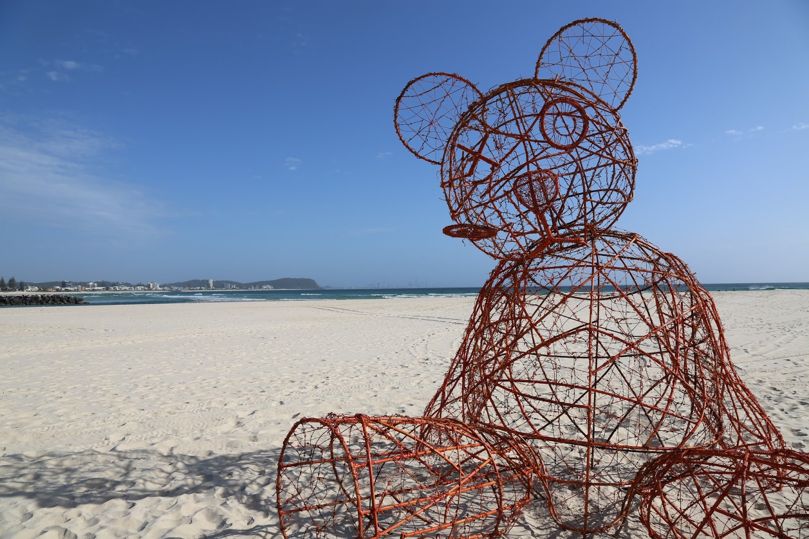
Here one recalls the barbed wire teddy bear, Prickles, number 2, the
winner, that looks just like a Coote illustration in this book. Is
the ‘egg’ in this egg-xciting, egg-xtraordinary,
egg-xceptional work:
its egg-cellence –
egg-xactly?
“Architecture
is like an egg, thought Robyn,
full of egg-xciting possibilities” p.24 (Oh
dear!)
02


Maree Coote illustration

21

Number 21, that
appears to happily promote ‘fantastic plastic,’ is perhaps the
prettiest of all the sculptures, but it seems to praise plastic
waste, to use this problem as an inspiration, when one might have
been more impressed with the expression of a greater concern for this
terrible polluting product that has consumed our lives and cluttered,
permeated our environment and ourselves. The only interesting
possibility is that a very little bit of the waste has found a new
life in this colourful piece – cost $7670. Is there a mysterious
symbolism in these numbers? Might it be the Boeing 767? Oh!

04

A subtle irony
The dingo work,
number 4, is one of the very few that touches on a lived experience –
‘to lock eye with a Dingo.’ Here lies the beginning of something
of quality, something substantial - Martin Buber wrote about this
experience in I and Thou - but it is difficult to achieve
depth of meaning out of recycled trash parts that mess and mock so
easily. Trotter was a master at this transformation with his early
animal works. His bits’n’pieces works now seem to rely on other
references that are less obvious in their readings; more quirky,
although expressed in a quaint manner, whatever they might be.
Meanings can torture experience, twist it, contort it, just as they
can, when there is an alignment, enrich and stimulate depths of
feeling and emotion. It is this lack of alignment that seems to be of
concern in the sculptures: a lack of cohesive emotional depth and
rigour. Much of the work appears strangely schizophrenic, uneasy and
uncertain in its being.


35

10
Here one looks back
to the lack of rigour in the management, and asks the obvious
question: but it seems there is no desire to change. Is it just too
easy to repeat things “forever and ever”? – (apologies to David
Bowie Heroes). The chairman’s introductory words are, “SWELL
makes it look too easy.” Maybe SWELL is made ‘too easy’ with
its annual repetition? One can, like John Betjeman, admire the
effort, but still acknowledge the weaknesses. It is sad that no one
appears interested in doing anything about these issues. Is this the
future of art; of SWELL? If it is, why not have an award for the most
fanciful text; the most obscure reference; the most kitsch of
analogies: a little like the ‘Ig Nobel’ awards? There is a lot of
material to choose from.

02
And the SWELL 2018
winner is: number 2 - a prickly decision? It seems to hold no
necessary symbolism in its message – merely the rough, explanatory
analogy and the words: it is difficult to bear. (Oh, punning is so
contagious!)


37
One can imagine
Michelangelo explaining his David in this context:
The male figure
has always engaged me. Its muscular vitality and intimate balance as
an expression of shared personal satisfaction and individual
contentment has stimulated me in my development as an artist. Marble
is the perfect material to express the translucent, soft sheen of the
skin; the gleaming beauty of the face; the hang of the loose locks;
the bouncy balance of the buttocks; the sinuous swelling of the
muscles; the surging stretch of the veins; and the intimate
intertwining of cultural meanings and diversions in a social
circumstance of engaged symbolism that weathers richly and improves,
consolidates with time and context as a sensuously tactile surface,
just as in the mystery of the journey of life and its continuum.
(POA.)

As the headlights swung across the work, it was transformed into a reflective wonder.
It is a shame the lighting did not explore this delight.
NOTES:
^
One
volunteer advised that only about one third of the submissions made
to the curatorial committee had been selected for the display.

#
While
much of the past was repeated, this year saw the removal of the food
area, and the ‘Smalls’ gallery. Thankfully the remote
food/gallery location promoted last year was abandoned, (this never
made sense), but it was not replaced by anything. These were
experienced as gaps like those between the sculptures. The food
outlets and gallery area did add another dimension to the event that
needs to be reconsidered, bettered. It was always odd to have food
squeezed into one corner on the other side of the road. Local outlets
offer some services, but food other than ice-creams on the ocean side
of the road, integrated with the displays, (maybe in the gaps?),
would enliven the precinct; allow folk to pause rather than merely
pass. In the same way, the ‘Smalls’ gallery offered another
dimension to the display, a nexus with the shops opposite, offering
smaller, more affordable pieces for review and purchase. It is always
of interest to see a maquette, to understand the artistic process of
developing an idea. The ‘Smalls’ also offered other artists an
opportunity for public display when their work might not have been
appropriate for outdoor display, either because of its scale and/or
materials. The possibilities for improvement are many: it merely
needs the will that first of all must acknowledge the gaps and the
potentials. Self-praise, with its blind self-satisfaction, can too
easily allow one to miss opportunities, just as it seems to have
allowed the simple error in the text that, at the best, reeks of
haste; at worst, carelessness.
(An
informant told us that the Gold Coast City Council would not let
SWELL use the usual food area as it killed the grass. One wonders:
why does the Council support this event?
This
individual also noted that not one nearby business would give SWELL
any space for the Smalls Gallery: but it seems that all adjacent
businesses like to profit form SWELL.
SWELL
needs to think around these strange complexities and solve the
problems positively rather than just accepting and forgetting them.)

*
Something
has to be said about the broad distribution of the sculptures. Anyone
looking at all of the works soon discovers that there are vast
distances to cover between the individual pieces that have been
distributed to fill the area that is normally used for a greater
number of sculptures. One does wonder about persons with prams and
those with any disability. With more works this year being located on
the sand, most of the exhibition seems to have been isolated from
folk who find traversing such surfaces difficult or impossible. This
is a public exhibition and should be accessible to all. There seemed
to be no necessity in favouring the beach as a display space because
there were large open spaces between the works in the grassed
esplanade areas. One might ask the organisers to give more thought to
accessibility. There does not appear to be any reason to sprawl out
other than this has always been done. Sculptures on the sand could be
located closer to the beach access points, making them readily
accessible to all, and closer to those who are unable to manage the
sand surface.
(The
informant told us that the location of the sculpture, on sand or
grass, was defined by the artist.)

##
The colour arrives at night. Like a few other pieces, the lighting
significantly transforms the piece. One never discovers this without
an evening visit. The challenge surely is to make all pieces equally
powerful in both the day and the night; otherwise, the likelihood is
that SWELL will become ‘sculpture by night,’ something akin to
Canberra’s marvellous Enlighten Festival.


But the intellect
just discriminates, it does not experience, and therefore does not
recognise the real value and truth in life. The intellect is the
prodigal son who forgot his original home. He is to be told of it and
to return.
Commentary
on Sengai, The Zen Master Catalogue Queensland Art Gallery
1985.


11

12

13

18

20

19

28

No comments:
Post a Comment
Note: only a member of this blog may post a comment.