Tuesday 28 August 2018

ROBYN BOID - EGG-CELLENCE IN MIND-GROWING OR GRATING PUNS?


Children’s books are frequently designed for adults, and appear to be aimed at the ‘parent market,’ possibly with the intent of feeding ambitions for raising elitely brilliant children, cashing-in on this urge. A friend gave a copy of ROBYN BOID ARCHITECT to me as a birthday gift, not for any child-rearing use, but as a book that might be of interest to me as an architect: and so it was. The idea of a shared adult/child involvement arises in films too, where movies ostensibly for children also have a layer of humour throughout that is aimed at adults. Adults do take children to the movies, so it makes sense in one way – well two: if the child is not interested, perhaps the adult might be the promoter, the enthusiast for the film. It looks like a cherry offering two bites, in case one chewer does not like the aftertaste.


"What a big book you have!"


It seems that there might be something of this strategy in this Melbournestyle Books publication of ‘Mind-Growing Books’ for ‘Clever Kids.’ This self-categorisation is actually printed as ‘clever kids MIND-GROWING BOOKS’ in a pinked-edged yellow medallion – is one supposed to see sparkling gold? The text wraps around a graphic ‘CK’ that is drawn as a smiley face within the ‘C’ placed beside a book that is the ‘K’ illustrated with splayed, open pages: does it mean ‘creating happy book-lovers’?


Maree Coote

The self-promotion appears over the top – just too much. Surely one decides after the reading and the interaction with the child whether the publication is ‘mind-growing’? Still, the book is intriguing. It is written and illustrated by Maree Coote. The lettering of the title looks like ‘childish,’ cutout-paper-styled text, with ‘ROBYN BOID’ in white, ‘ARCHITECT’ in letters using nine different colours, (creative), and ‘Maree Coote,’ the author, defined in text tucked away cosily in the same white on brownish ‘nest scribble’ that includes a speckled egg on one side and a feather. All of these graphics are on a pale sky blue. A sketched paler blue and white bird flies over the ‘CH’ of the multicoloured ‘ARCHITECT,’ perhaps identifying the reference ‘bird’ in case it was missed as the mysterious, misspelled ‘Boid.’


The cover has an attractive, commanding identity and a direct message. The terrible naming using the phonetic pun is immediately obvious to those ‘in the know,’ and sets the scene for expectations that are confirmed: corny. One wonders if and why the gangster-sounding, nasal American accent of ‘boid,’ that hangs between ‘Boyd’ and ‘bird,’ referencing both of these spellings, has any relevance beyond the fact that it does cleverly allude to both. Is there something cheekily bold, brazen and ‘gangsterish’ implicated here? More intimately, one notices how the ‘Robin Boyd’ reference is so ‘tight, snug’ with the title reversing the ‘I’ and the ‘Y’ to give us this personable ‘Boyd-biod-bird’ link.


Is the title just too clever – too ‘adult-clever’ to be useful even for ‘clever kids’? Maybe it is the ‘adult’ drawcard, offering some pride, some silent, personal self-praise to the one who immediately, cleverly recognises the references? Is this the feel-good introduction, the prelude to the suggestive ‘buy me’ message? In a world where spelling has become almost as irrelevant as grammar, and where new spellings for names are invented as a matter of necessity every day, one wonders how sensible it might be to promote such variants in things phonetic for children, when a slightly more serious – and more useful? - book might spell names correctly; well, as the architect was so named.# The book too, might start the story accurately telling us that Robin Boyd ‘Boid’ attended Melbourne University rather than ‘Robyn Boid lived at the National University, high up on a ledge of the Architecture School’ - see: http://adb.anu.edu.au/biography/boyd-robin-gerard-9560 Why back away from such facts when the title is so adamant in its telling, its suggestive message?


"The silly bird"?

The play in the name ‘Boid,’ meant to be read as ‘bird’ for the story, with ‘Boyd’ apparently hovering in the background – this is a ‘Melbournestyles Book’ after all - casts an immediate shadow, doubt, over the author’s name: is it a joke? - ‘Maree Coote.’ Is one supposed to do anything with this in the game of phonetical interpretation or other referencing? Maybe: ‘Mary Coote, the silly bird’? Is ‘Boid’ a cute ‘Coote’? Who knows? The ancestory.com site notes:

Coote Name Meaning
English: from Middle English co(o)te ‘coot’, applied as a nickname for a bald or stupid man. The bird was regarded as bald because of the large white patch, an extension of the bill, on its head. It is less easy to say how it acquired the reputation for stupidity.
Source: Dictionary of American Family Names ©2013, Oxford University Press
Similar surnames: Foote, Cote, Conte, Coots, Coe, Crute, Corte, Cooper, Motte, Coomer


I am interested in books on architecture that have been written for children, just as I am interested in most books for children that have been written by serious writers. Ted Hughes’ book on poetry explained for children is impressive as it tackles everything seriously, simply, openly, rather than in a complicated, skewed, child-like fashion. Strangely, most of the books on architecture for children introduce the subject by talking about the birds and the bees: not sex, but how birds build nests, and bees build their hexagonal hives. This raises the issue of shelter that then moves on into caves and the like for ‘man,’ men and women: the rest is history. Here, Coote takes the ‘nest’ idea and makes it into the whole theme; everything is a nest. She begins with the question, ‘What comes first: the nest or the egg?’ One immediately knows the ‘chicken-egg’ question, and the lack of an answer, and wonders what the Coote question might be about. Could it be referencing form and function?


The ‘boid’ then explores various geometrical, Platonic(?) shapes. The idea that architecture involves ‘thinking outside of the circle’ is then floated, laying the subtle suggestion that architecture, even at this early stage, is something uniquely different: ‘thinking outside of the square.’ So the nest is inverted, creating a dome: then the games develop. One expects the Goldilocks idea to be used: too big; too cold; too small; too rough; etc. In one way it does become the theme, but indirectly. Cootes muddles this old story-line that always makes for a good child’s book as it involves experience; feelings. She mixes the idea with architectural matters as she explores various historical examples and architectural details, noting how clever ‘boid’ is to build these, and that none of these models is good for eggs. Why should they be? Is ‘egg’ meant to be symbolic of some nice fit for function? What function? What fit? We get the sense that ‘boid’ is wanting to create a startlingly different ‘architectural’ nest. One wonders why the original nest was rejected, inverted, (to let the egg fall out), and otherwise distorted and defaced. This strategy is, of course, simply a way of introducing names and buildings that teachers can use as ‘teaching aids.’ The message at the rear of the book tells one that this is so on various levels, just in case teachers do not know how to use the publication. The book has to be something to make ‘kids clever;’ and parents smarter too? ‘CAN YOU COUNT the 34 speckled eggs; CAN YOU FIND the 14 wiggly worms?’ Even counting skills get involved in this educational tome.


Hardly a 'nest,' but an impressive interpretation.


Our ‘boid’ flies over historical buildings and other examples, all illustrated ‘nest-like’ in brownish scribbled lines, with Coote noting how each example is no good for the egg. Finally, ‘boid’ discovers ‘egg-actly the right shape for the egg’ . . . ‘egg-shaped’ - on page 19: shucks! Is this really so? Pages 20 and 21 get filled with ‘egg-shaped’ holes in ‘nested’ buildings that are apparently perfect containers. Pages 22 and 23 do likewise, complete with hanging egg chairs, egg-shaped openings and egg-shaped curves in scrawled, hatched, thatched(?), walls and roofs. The inspiration for ‘Robyn Boid’s Nest-Building’ ideas are listed on page 25. The building images on pages 22 and 23 were inspired by Robin Boyd’s ‘Casa Lloyd, Melbourne.’ The book finishes up with Robyn Boid wanting to write a book – of course; what else? – called Great Egg-xpectations:Architecture is like an egg, thought Robyn, full of egg-citing possibilities.’ Oooooh! It almost hurts. What might the author of The Australian Ugliness think of this? What happened to the symbolism? Is it really too hard to be serious about children’s books? What might the children think when they discover that Great Expectations is Charles Dickens’ thirteenth novel, and has little to do with architecture? Are the children as readers merely being ‘egged’ on with adult versions of the child’s mind?


1. A bird can live anywhere, but an egg needs a nest. (really?)
2. Thinking outside the circle can lead to egg-xcellent ideas.
3. The egg comes first. (?)

Perhaps there is something one can be pleased with here, in this publication - maybe that it is about architecture; but there is much that grates and grinds; and there is the concern about talking down to children in ‘childish’ chat. It is a little like the stuttering attempts at exaggerated simplicity in hyphenated English that one hears when another is speaking to a person not fluent in English: words are transformed into pidgin soundings, grammar is clipped, and volume is increased in a concerted effort to make sounds more easily comprehended, as if this befuddling approach might make anything more intelligible. Does this Coote book do too much of this? It is a little disconcerting that architecture is seen as something special, uniquely different. Why promote this vision that causes so much strife for the profession? Might a greater emphasis on the quality of the fit in the solution have been a more appropriate approach to touch on, to allude to - a quality within architecture as an experience, rather than endorsing mere visual appearance and impact? This, of course, would have meant that the original nest was discovered to be the best: "Why did I ever turn it upside down?" – an outcome at odds with the ‘clever kids’ educational intent. What really is the message?


Inspired by Boyd's Casa Lloyd and hanging egg chairs.

The subtle touch at the end of the book is a nod towards ‘good architecture,’ and references the Casa Lloyd, Melbourne, 1960, a Robin Boyd residence – mmm: think ‘Boid.’ I did not know ‘eeg-actly,’ (yuk!), what this building was; I could not recall it, so I looked it up. There was nothing in Google Images, so I checked the text references. Could this be so?

Robin Boyd-house faces wreckers’ ball 28 June 2003 – 10:00am The Age.

A Brighton house designed by influential Melbourne architect Robin Boyd is likely to be demolished next week after Heritage Victoria decided it was not of state significance.
The crescent-shaped glass and wood house in Newbay Crescent, Brighton, was built in 1959 to a Robin Boyd design that featured a curved building overlooking a pear tree.
A photo of the house, which was built for local barrister Edward Lloyd and his family, was reproduced on the cover of Robin Boyd's biography by Geoffrey Serle. But experts and residents are in dispute over whether the house is important enough to warrant heritage protection.
Professor Philip Goad, of Melbourne University's architecture faculty, said yesterday that the house was a valuable part of Victoria's architectural heritage and it would be a great pity if it were demolished. He said the home was built when Boyd was at the height of his powers. It was among his 20 best houses.
But Neil Clerehan, an architect and former colleague of Boyd, said the house had been substantially altered and was no longer worth saving. "There are many more important Boyd houses that councils are not doing anything about. This is a minor work," he said.
A Heritage Victoria spokeswoman said executive director Ray Tonkin had recommended the house be allocated only "local" significance.
The manager of sustainability at Bayside Council, Michael Top, said that if the recommendation was accepted at a Heritage Council meeting next Thursday the house would be demolished.
Mr Top said the Boyd home had been assessed twice and was not on a council list of 1000 significant buildings.
But Bernard Lloyd, who grew up in the house, said he had made a late submission to Heritage Victoria seeking to have the house protected.
He said that even though the house was not visible from the street or open to the public, it should be saved.
"I've never been in a house like it. It is curved. There is not a single right-angle in it. I remember when I was growing up, architecture students used to knock on the door and ask if they could have a look at it," he said.
Charles Butler, who bought the house from the Lloyd family in March, said Mr Lloyd had been unfair because he did not warn him that the house was of heritage significance before the sale.
He said he would lose hundreds of thousands of dollars if he was unable to knock the house down.
"If Bernard Lloyd believes this house warrants heritage protection, then for heaven's sake why didn't he do something while he was living in the house?" he said. He said an interim order prevented him from knocking down the house and the "whole process had been an emotional wrench".
Shirley Andersson, acting secretary of the Bayside Ratepayers Association, said it was extraordinary that the Lloyd family was trying to dictate what could be done with the house.


The hanging egg chair - for big 'egg-heads'?


The ghost of Casa Lloyd?
Was this the Casa Lloyd reference made by Coote? Serle’s book cover illustration was Googled. Does the building still stand in 2017, the publishing date? Children might be savvy with the Internet and Google, but will they discover any illustration of the main ‘good-feel/fit’ reference from which to learn? The Sydney Opera House, Wangu Pavilion, Saint Basil’s Cathedral, The Chrysler Building, The Sydney Tower, Eiffel Tower, etc., (all inspirations listed in the back of the book), can be researched; but the poor Boyd/‘Boid’ building? Is the lesson that everything eventually passes, even good work?


The sketch of Casa Lloyd - from the book cover?

As John Betjeman said of his poems that had been put to music and dance by others: he admired the effort, but thought that it added very little. In a similar manner, this book by Coote can be acknowledged as a good effort, perhaps adding as much to architecture as Betjeman spoke about the music and dance adding to his work. It has to be acknowledged that writing for children is one of the most difficult things to do successfully. It requires less effort, and more inspiration; a sheer delight with the enterprise: something seriously childlike in its being. In this sense the books will always relate to the adult, the child at heart, without any clever, self-conscious distortion, any predetermined, carefully-structured strategies and games, or any silly puns.


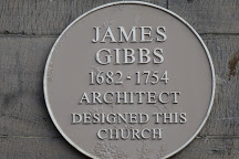
Robin Boyd Architect
3 January 1919 - 16 October 1971


# NOTE:
Even Google is confused with ‘Robyn Boid’: ‘Showing results for: Robin Boyd’ - as if it is being helpful.


P.S. All images have been selected from Google Images.

MORE EGG SHAPED CHAIRS & BUILDINGS
JUST FOR THE STORY PUNS


Math-egg-matics?


Scrambled eggs?

A 'three-minute' egg: soft centre?


Just a yolk? (Punning is contagious).


Hard-boiled egg?

Egg cup?

Egg- aggerated?


EGG-CITING!
BUT DO THEY SUIT EGGS?

NOTE
28 February 2020
A point of further importance is this: that the traditional oral literatures interested not only all classes, but also all ages of the population; while the books that are nowadays written expressly "for children" are such as no mature mind could tolerate; it is now only the comic strips that appeal alike to children who have been given nothing better and at the same time to "adults" who have never grown up.

5 APRIL 2021
SEE: 
and

THE KIRK OF ST. NICHOLAS, ABERDEEN – TWIN WONDER


Union Street, Aberdeen has always been an iconic urban attraction. It presents a simple rigour in planning and expression that impresses as a civic spine, a linear place. One is tempted to call the street an ‘axis,’ but it holds nothing axial about it. The street has its own inner stability, something steady, strong and substantial. It has a satisfactorily 'rock solid,' Aberdeen ‘granite’ quality about it, which comes as no surprise. There is a contentment with the street's just being there, being itself rather than working hard to otherwise display, link and connect, as axes do. So it was that, on our return to Aberdeen while in transit back to Australia, we were happy to once again spend a day strolling along Union Street and exploring its precincts. The scant and scattered intrigues of tourism had nothing to do with these essential delights that made being there meaningful without special intent: see - http://springbrooklocale.blogspot.com/2012/06/who-or-what-is-tourist.html

Union Street, Aberdeen


Aberdeen


One particular location along this ‘avenue’ has always been a memorable place. No, this is wrong: it is not an 'avenue' - ‘boulevard’ might be a better description; but this is still not right: 'boulevard' is too pompous for the dour Scots, too smart a term; too self-conscious. Simply, plainly and bluntly, ‘street’ is the best word for this prominent, civic thoroughfare, a linear urban void that authoritatively gathers the city in around its length, its strength. The extraordinary place on this street is the Kirk of St Nicholas and its environs. The churchyard has its own unique, stately presence in the city as an island site. The church building, standing askew across the precinct, forms the core nodal mass of the complex that separates, shapes and structures the various churchyard zones, while dominating the city’s skyline.

The kirk on Union Street


The Kirk of St. Nicholas

The plaque on the western front

The east end of the kirk


Approaching the Kirk of St. Nicholas from the east, passing Starbucks on the laneway leading from the shopping centre that steals the church’s name, one is confronted with the grim, tall, Gothic mass of the east end of the church with its bold, splayed buttresses. These walls stand in an intimate relationship with public space, defining it, dividing it, detouring it, organically making and shaping the northern and southern entrances into the churchyard in an invitingly casual, friendly manner. It is a circumstance rarely seen in the architecture of today: the care for the private and the public, the sharing of richness in twin possibilities without compromise. One is reminded of Aldo van Eyck’s ‘twinness’ referred to in Team 10 Primer Alison Smithson, editor; MIT Press, 1974.


The eastern gates to the churchyard

The path in from the north


Arriving at the kirk from the north along Upperkirkgate, one walks beside a granite and cast iron fence until its repetitive stepping is disrupted at the old Lodge to form a gated void that opens up into the pleasantly patterned paving of the graveyard. Paths from this street entry adjacent to its shopping centre neighbour, lead to the northern church doorway, connect with the eastern entry, and continue to the main western front. The spaces around the kirk are quietly welcoming, and have seats that invite one to pause and ponder. “There, but for the grace of God . . .” said one passerby as I photographed the gravestones: indeed. The grey, weathered, shadowy mass of the kirk provides a solemn background for the ancient gravestones that tell of other times, other lives. These darkly grim church walls slice across the site in the prescribed east-west orientation, ignoring all other alignments as they define their own twinned identities of interior and exterior place. Again one recalls van Eyck’s writings in the Primer - ‘place, not space.’


The west door


The western gates opening to Back Wynd

At the classic western front, one is confronted with a typical church door – twin, large and massive – standing above a formal set of four stairs opening out as a platform projecting into a tiny courtyard zone, the western entrance. This approach also happens to be the vehicular access for the site. The gateway opens onto the narrow lane, Back Wynd, connecting Union Street on the south with Upperkirkgate on the north. Shops along this wynd make it an interesting inner-city alleyway. This side boundary of the churchyard that encloses the graveyard is one of the most memorable walls in the world – see: http://voussoirs.blogspot.com/2016/09/aberdeens-wall-place-between.html Here gravestones stand against the boundary and, from the lane, form an ad hoc, profiled top that is surprisingly, astonishingly beautiful. This dividing element gives a twin significance to both its sides, providing a modest background for the dominant grave stones on one side, while highlighting the shaping of their prominence as ‘shadows’ on the other, all without exaggeration of embarrassment. It is a mesmerising civic sight: a simple, unapologetic joy that considers, acknowledges and encompasses the necessities of life and death at the interface.


Back Wynd wall


Union Street


As if this casual interweaving and integration of spiritual place into the everyday city circumstance on the east, north and west was not enough, the approach to the kirk from the south, off Union Street, offers one of the grandest, genuine gestures to the street that one can see. In all of the chat about context and place in modern architecture, their singular significance and pertinency, there is nothing as deliberately beautiful, as subtle and engagingly self-consciously prominent as the Union Street entry screen/gateway. It stands like a bold, urban folly, but one rich with meaning, identity and relevance.


The path leading in form Union Street

This element sits comfortably with the presence and pattern of the street, its consistence, matching the substance of and detail in the elevations of the neighbouring buildings that make the street, just as the street makes them. Instead of a contrasting, green, open gap, like a missing tooth in the continuity of the street frontage, the churchyard has been given a deliberately formal facade that replicates the colour, scale and massing of the adjacent architecture without mimicry, creating a screen/gateway that defines both public place and graveyard privacy, boldly mediating between life and death. This structure is a large array of columns topped with a simple stone entablature, and with metal screen/fencing elements in between. That such an effort could be made both to identify the kirk and its yard, and to acknowledge the street, to recognise and harmonise ‘twinness’ with its structural scale, sense, detail, and experience, is remarkable. It is this element alone that makes Union Street so significant, as the gateway-screen reinforces everything that the street is about: the classic forms confirm a meticulous, calculated purpose; the street’s civic deliberateness. This is Aberdeen at its best.


The screening-street element shapes the main gateway entrance to the kirk that opens onto shady, leafy paths. These 'crazy-paved' paths branch off to the various other entrances to the precinct, north, west and east, and to the kirk's doorways. Seats encourage one to share the quiet of the place, its reverence. This is hallowed land, a place for the dead, for the past to be remembered, for contemplation, for worship; but it is a welcoming place for the living too, not a mere sombre, no-man’s-land retreat into the fearful void of bleak nothingness, suggesting a gloomy hopelessness. Here, the place for the dead has been intertwined with daily city life, twinned purposefully with it as yin and yang. The kirk's precincts are not only a destination for quiet recreation, their paths also offer refreshing thoroughfares, interesting detours to other parts of the city beyond: the stones integrate and intermingle with the surrounding lanes and streets.


The south door


The graveyard has become a green retreat, a gentle refuge from the business of the street, as well as a place for the dead. Folk stroll and pause, not only to reflect on other people and other times – the history is astonishing – but they also pop in for lunch; for a rest, a break; to enjoy the sun, a chat; sometimes just to take a different path to elsewhere, maybe a shortcut. There is nothing overwhelmingly bleak about the gravestones: they are friends that remind one of the reality of life, its transitoriness; its brevity: they tell stories or are just there, depending on what one is seeking, feeling. Sometimes these weathered and worn stones, in their table form, provide a spot for one to squat on while snacking during a break from the office, or while just gathering one's thoughts. Strangely, this ad hoc usage shows more respect than any rude disregard, an intimate sharing and caring, with the grave marker happily being offered as a seat. The kirkyard is truly a remarkable place because of what it is and how it is used. That these functions have all been encouraged and shaped by the plan, the strict orientation and placement of the kirk building, and the detailing of its kirkyard boundaries, shows a sensitivity to a self-conscious civic involvement that seems to evade the understanding of modern architecture.


Table graves


There is something modest here that humbles one, something, on reflection, more than the graves might usually offer to the living. The only concern was that the kirk itself was locked, opened to the public on defined occasions that did not include one of the times we were there. This disturbed the concept of the open and friendly precinct that eventually stifled the welcome with exclusion, creating a central black hole, establishing the kirk as a boundary. 


An image had been seen a couple of years ago in an Aberdeen arts publication that suggested that this was a ‘sideways’ kirk: see - http://voussoirs.blogspot.com/2017/04/shetlands-sideways-churches-creativity.html One was keen to see the interior in order to check, to confirm this possibility. Alas, this was not to be. Even though there were signs of habitation – vehicles nearby, and lights on – all knocks were ignored and locks were left unopened. The '11:00am Sunday service' notice seemed to mean nothing. Did the church not want worshippers? We were there on a Sunday at the right time, but there was not one open door, nor any service, just the usual friendly, open access to the graveyard. The need to know the layout became a minor obsession. This could be important in understanding the ‘sideways’ development, opening up a new scale of operation in this form of planning. The exterior was explicit, but what was the interior? It was not clear.

The uncertainty of the interior that appears axial


Back home, the search for more interior photographs and the floor plan began. The photographs were never quite distinctive enough to be sure, certain, but eventually the plan was discovered and printed. This was not one church, but two: twins – a West Church, (‘Seats for 1100’), and an East Church, quaintly named ‘Quire,’ (‘Seats for 1700’), as if it might be the choir of an integrated Gothic church space. At the eastern end of the East Church was St. Mary’s Chapel and the vestry, the spaces that were enclosed by the massive walls that framed the eastern laneway approach. The chapel had its own strange history. Apparently witches had been locked up here in the sixteenth century witch-hunts prior to their trails and death. Between these western and eastern places of worship, were the massive arches below the central tower that formed part of the enclosure of what was labelled in bold, Gothic lettering, ‘Drum’s Aisle’ and ‘Collison’s Aisle.’


This obscure 'Gothicked' labelling had originally been misread as ‘Drum’s Hisle,’ and was Googled as this to see just what it was referring to: an individual’s Christian name? It made little sense. Soon it became clear that the word was ‘Aisle.’ One of the references that was followed up turned out to be in Google Books, that cleverly highlighted the words ‘Drum’s Aisle’ in the text of an old publication on the history of Aberdeen by Robert Wilson, A.M., An Historical Account and Delineation of Aberdeen, published in 1822.


Google Books


It was in this text that the Kirk of St. Nicholas, its history, form and interior, were described in intimate and specific detail (Sacred Edifices p.68 – 79) – see: https://books.google.com.au/books?id=HWY_AQAAMAAJ&pg=PA70&lpg=PA70&dq=drum%27s+aisle&source=bl&ots=PPiIeBMu8Z&sig=fwhbmFXrTv8STzoOeQN_5Bsk8qc&hl=en&sa=X&ved=2ahUKEwilgvvWvYTdAhWVHXAKHRAQCdoQ6AEwEXoECAgQAQ#v=onepage&q=drum's%20aisle&f=false Wilson comments that the pulpit of the Western Church is ‘located on the central pier.’ This could now be confirmed in the re-reading of some of the photographs. So this plan has the elements of a sideways kirk, but comes with an upper gallery or mezzanine on all four sides of the kirk. If one removed the southern spaces and gallery behind the pulpit, one would have the typical ‘sideways’ plan. (Streetview - see below -  seems to suggest that these spaces are service/circulation areas.)^ Could this variation be an early version, an experimental scheme, trying out a different layout, perhaps in response to a new understanding of the liturgy, or the desire to break from the old? While of interest, the West Church plan seemed awkward and messy, unlike the tight functionality of the Shetland ‘sideways’ plan. Could it have been inspired by the East Church layout?


There was a puzzle with the East Church: this plan looked smaller in area, but the note said that it was able to seat 600 more people than the West Church. This enigma was solved by the old text that described the East Church as having ‘galleries on the north and south, and double-height galleries on the west.’ This setout shaped the space precisely in plan as the model for the ‘sideways’ kirks; but this was no ‘sideways’ plan: it was a squat, short, east-west axial basilica plan with galleries. Did the newer West Church attempt to recreate the East Church layout in a rectangular profile? Is this the early days of the development of the little Shetland ‘sideways’ kirks that do likewise, but more successfully?


All church spaces in the Kirk of St. Nicholas had corner stairs typical of the ‘sideways’ plans and suggested the beginnings for this unique inversion in Shetland worship. The Robert Wilson book did not comment on any plan beyond factual description, but it did explain the unusual naming of the core spaces: these ‘Aisles’ referred to the names of the Drum family and the Collison family, and were burial places for these lineages, now used otherwise for entry and kirk meetings.

Drum's Aisle


The screen to the kirkyard in context


Union Bridge

Browsing through the old text and its 'delineations' was interesting as it had numerous engravings of buildings and bridges of old Aberdeen. One could recognise it immediately – Union Bridge. Even though illustrated in its original context prior to the construction of Union Street and its associated development, the current street experience of this bridge, its environs and details, remain clear and recognisable in this engraving. The sense of this strong link to other times impressed; it gave substance to our more flighty, self-indulgent era.


This published collected and illustrated history of Aberdeen is a remarkable text that describes noteworthy places very precisely, thoroughly, and carefully. One can still enjoy Union Street today, and the Kirk of St. Nicholas: their essence, substance, remains in tact, with very little modification. They still dominate the modern world, and remain special places in spite of the change, ordinary but extraordinary in nearly every way. They are places for people, twins within twins, twinning, welcoming and supporting the life of the everyday; embodying simple city life without pretence or posing; without slick style, sly pomp, or sleek circumstance. They have much to teach us by way of obvious example: but will we learn as we continue to eulogise bespoke differences and extremes, and turn our attention away from the wonder of things ordinary and the joy of their use, their unselfconscious, unpretentious experience? It is the ordinary that we ignore at our peril, as if we might know better.#

The kirk and yard prior to the construction of Union Street


#
Here, again on the graveyard theme, one thinks of the new graveyard expansions on Unst, Shetland – in particular, the Baliasta Kirkyard comes to mind. While being beautifully detailed and nicely, sensitively set out and finished, the graves in the new yard are positioned north/south, as if the strict east/west of the old layouts meant nothing. There might have been some efficiency involved in planning or some other reasonable excuse, but the old symbolism did mean something – facing the ‘Son of Man’ rising in the east on resurrection* - and needed respect and recognition rather than rejection in favour of modern calculations and visions. In the Lund Kirkyard, the new graves are located east/west, but strangely turn their backs on the path that leads through to the old yard, as if they intend to ignore the living. Just why the stones face west when all others in the old yard face east, remains a planner’s puzzle yet to be solved. Such is modernity.


The old Baliasta Kirkyard with graves facing east

* NOTE:
The traditional Christian method of positioning the coffin or shroud covered body in the grave was to have the body with the head to the west, feet to the east. The body was placed face up. When it was not practical to use the west-east position for the grave, a north-south positioning was the next best option. There the body would then be laid on its side, head to the north and facing east. Not all burials followed the tradition nor did all cemeteries.
The reason for the east facing position is offered by Tom Kunesh:
Note that in Christianity, the star (of the Jewish astronomers from Iraq [Babylon]) comes from the east. Then there is Matthew 24:27 (NKJ): “For as the lightning comes from the east and flashes to the west, so also will the coming of the Son of Man be ...” thus for the Christian believer in the resurrection of the dead, placing the body facing east will allow the dead to see the Second Coming of Jesus.

P.S.
The Google Books text spoke about the upper gallery of the East Church as being 'for seamen,' as it had a model ship suspended over it. This seems to have more to do with the symbolism of the ship rather than any specific occupation: see - http://voussoirs.blogspot.com/2017/02/ulvik-church-norway-tradition-in-timber.html


SOME COLLECTED IMAGES
UNION STREET & TIME


Aberdeen 'Granite City'

 ^
STREET VIEW
One has to remember Street View: see – http://voussoirs.blogspot.com/2017/10/the-need-for-street-view-in-architecture.html Visiting the Kirk of St. Nicholas, Aberdeen in Google Earth, clicking on the little figure, and browsing the Street View options along the blue lines or at the various blue dots is really informative. It reveals the importance of Street View in architecture yet again. Here one discovers not only the environs of all locations around the site and in the graveyard, but also 3D images of the interior of the West Church, the Drum’s Aisle, the bells in the tower, and the clocks above. It is a wonderful tool that highlights the ‘sideways’ structure of the space, and suggests that the East Church is being renovated or restored. There are no interior images of the East Church, but one glimpse through the door of the Drum’s Aisle seems to show the space as a building site. One has to rely on Robert Wilson’s description to understand this space.

NOTE
6 JAN 2019

A copy of the Reader's Digest publication, The Best of Britain and Ireland from the Air, published in 2011, was recently found in a secondhand bookshop and purchased. It had photographs of the Shetland Islands and the Orkneys. Just why Papa Stour was selected to be 'the best' of Shetland remains an enigma. Maybe the photograph was just readily available for this 'digest'?


On perusing the publication later, an aerial image of Aberdeen was discovered. It was interesting to see Union Street and the kirkyard of St Nicholas in the context of the city. The street holds the same authority from the air as it does at street level. The harbour with the ferry that services the Shetland Islands can be seen on the bottom right of the photograph, close to the western end of Union Street.

The ferry is in the upper portion of the harbour that is so snug that the boat has to turn and reverse into its berth.

The significance of the kirkyard is also clearly revealed from above. It is a core inner-city green space. The aerial view makes its importance clear: it is a place that connects as well as one that offers refuge from the busy streets for relaxation and contemplation.


The unique east/west alignment of the kirk is evident from this viewpoint too, highlighting the presence of this dominant civic landmark in the image of the plan as well as that of the cityscape.

The various N, S, E & W approaches to the kirkyard are clear from the air, as are the pathways around the kirk.
The deliberateness of the formal Union Street screen can be appreciated from above.

The Shetland Islands ferry berthed in Aberdeen harbour