

Images of the BKK Architects ‘Geelong Ring Road Rest Areas’
project filled both front and back covers of the Steel Profile 120 May
2015. It was the first article in the publication that is well produced and
promotes steel with an informative panache and style. Yet it was not the images
illustrating this project that immediately caught the eye. It was the enigmatic
headline: REST-AREA RọNCHAMP. The ‘o’ in Ronchamp was a strange lower case with
a line below, an invention that was not available as a letter symbol on this
computer. Perhaps it is a part of the font style that has the quirky left-hand
slice out of the ‘R’ and ‘P’? One wondered why: not only why the strange ‘o’
graphic, and ‘R’s and ‘P,’ but also why the reference to le Corbusier’s
beautiful chapel at Ronchamp?


The next page explained in large, summarising text: “The
reference to the chapel at Ronchamp was a tongue-in-cheek way of posing the
question: ‘Can these structures be important civic buildings?’ ” ‘Cheek’ seems
to be the relevant word here. The simple answer is always that any building can
be an important ‘civic’ building if sensitive to its context and role, and is carefully
considered, designed and detailed. This does not mean that it has to be grand
or significantly notable, noble or unique in any special or different way. That
these structures are located on a freeway as a rest area development does not
mean that they can never be ‘civic.’ Ronchamp is not needed to realise this, to
even ‘discover’ this circumstance, or to investigate it. Indeed, why even
choose Ronchamp to start with?

One is left pondering: why does Ronchamp get drawn into this
‘tongue-in-cheek’ game? Other references are suggested: “The buildings are
humorous and the architectural language draws from many sources,” he (BKK
director Kosloff) continues. “They reference popular culture, but also pay
homage to civic spires and clock towers in medieval towns. They are markers
that locate the driver within the freeway landscape.” The ‘popular culture’
reference needs more explanation, but one can see some suggestion of a Ronchamp
and medieval style in these forms. Is Venturi’s Learning from Las Vegas
intended to be a reference here too when things are seen as a large freeway
advertisement or ‘civic’ neon sign?


One is reminded of a project published in the Architectural Review many years ago, maybe in the mid-1960s. The prime image of this large commercial project was the skylight over the sunken staff restaurant. It was a dramatic, eye-catching, twin skylight form fabricated from fibreglass, enigmatic. It not only made a spectacular sculptural statement in the courtyard during the day, but it glowed at night with a strange, mythic authority. It was Walter Gropius who noticed the source and reprimanded the architects for using ancient symbols in such a random manner. The form of the skylight was identical to the horns of the bull of Minos, that marvellous Minoan sculpture at Knossos on Crete. Gropius made the point that one should respect ancient symbols and forms that had been generated for spiritual and symbolic purposes, that these shapes should not be adopted as references or forms for the crass, mediocre expression of functional skylights over a staff canteen, just for the self-importance of the architectural scheme.#


One has to ask why Ronchamp is drawn in as a reference in a rest area toilet form. Indeed, why medieval clock towers and spires have been used to inspire, (forgive the unintended pun), motorists to stop for a pee or perhaps just tea – maybe both? These rest areas always have their own strange feeling about them, as transient places, maybe slightly or potentially spooky too. Who can forget the hype of highway murders? Who knows who might turn up, and when, in these public places located nowhere in particular, in no man’s land? The issue that Gropius raised is still relevant today. Forms are not merely there for others to grab and use in any way that might be chosen, humorously, ironically or otherwise. Respect is needed, even if one cannot understand the religious or spiritual sensibility that shaped the sources. The act of referencing and re-use demeans the original, hardens others to their subtlety: turns art and architecture into an irrelevant, indulgent, superficial game.


This is not the first time that the chapel at Ronchamp has been referenced. I can recall a pumping station and a residence that have been inspired by its unique identity and spirit that is difficult to explain: see - http://voussoirs.blogspot.com.au/2012/05/ronchamp-windsock-of-spirit.html But one does need to control one’s feelings and enthusiasm, indeed love for this building, this place high in the mountains above a tiny French village. Freeways have little to do with this remote place. Wanting to be clever with a text and an idea does not make it available for any extravagance that might appear smart or overtly clever as an ‘academic’ strategy.


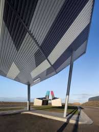
The photographs are by John Gollings and Paul Bradshaw, but in spite of the rationale of these structures being explained as forms, ‘markers,’ that catch the eye of the driver of a vehicle moving at 100 kph, not one image has been shown of this development as seen from the freeway, as drivers would experience it. Why? The photographs all rotate about the structures and their special identity and relationships, showing ‘Ronchamp-like’ details against fluffy clouds in a blue sky.


Le Corbusier's chapel at Ronchamp

Surely if everything is about freeway identity, the primal and most informative image would be the reading of this place from the position of speedy passersby, for this is what is said to be the characteristic that will encourage the drivers to pause, for a pee, tea or otherwise: perhaps just to enjoy this special place, Ronchamp-like or not? One is left wondering if the lack of any freeway vista might be because the project does not appear as the ‘marker’ beacon that it is described as. An image on-line suggests that the freeway forms and signs might be more dominant than these background ‘references.’# Oddly, only one view to the freeway and a few odd glimpses of it are included in the Steel Profile piece.

This image found on-line was not published in Steel Profile
In the end the whole feels somewhat contrived, just like the references, with the images seeking out Ronchamp-esque angles and roof projections. This project is not alone: see - http://voussoirs.blogspot.com.au/2013/03/parco-echoes-of-ronchamp.html Buildings will not be more ‘civic’ because of this contrivance. Being ‘civic’ has more to do with an integrity, an inner coherence and respectful stamina that relates to people and places in a unique way, not necessarily humourously, which seems more like an excuse to counter the Gropius complaint, nor in any way self-consciously clever or ‘intellectual.’ Things ‘civic’ just are because they are what they are: what they want to be, as Kahn has said. Good buildings always have a ‘civic’ quality about them.

I can recall trying to explain how the buildings at the Warrumbungle National Park near Coonabarabran in New South Wales were important as architecture. These simple, rustic structures have more things ‘civic’ about them that most contrived places. There was innocence, a rigour that defined place, made people feel place as location. Poles, corrugated iron walls and water tanks, and timber frames were all articulated with a naïve, even ad hoc classicism that echoed organisation and thought anchored with origins in ordinary living and thinking, not in self-conscious contrivances, connivances or sundry references. Nothing was ‘clever’ here, but it was simple and skilful – ‘civic’ in a special way any building can be: c.f. the building at Nimbin with the ‘sophistication’ of the Leplastrier design solution in http://voussoirs.blogspot.com.au/2015/01/richard-leplastrier-ephemeral.html

We should be wary of indulging in architectural games with ad hoc sources used just for the claimed playfulness. It was Gropius who, in his important book on design, The Scope of Total Architecture, argued that history should be taught before design, not in order to use history as a pattern book, but to expose the student to the challenges and solutions of other eras, the depth and coherence of architecture: to reveal the broad knowing of the tasks and the possibilities. He himself was sensitive to the past. He wrote a piece on Katsura in Arata Isozaki’s Katsura: Imperial Villa. This is how we should look at Ronchamp and medieval spires and towers, not as pawns in a fabricated game of ‘narratives’ on form to be used to define, to inform an ad hoc personal ‘journey.’ We need to know more about meaning, the meaning of meaning, if our buildings are going to be truly meaningful: even ‘civic’: see - http://voussoirs.blogspot.com.au/2014/05/civic-details-importance-of-little.html

P.S.
When looking at the on-line images of this project, what appeared to be a CAD image of this project was discovered on the a as architecture site http://aasarchitecture.com/ The surprising title in bold black block letters on background blanc below the image read: GEELONG RING ROAD TRUCK STOP REST AREAS BY BKK ARCHITECTS. This ‘truck’ description adds a strange feel to the whole that the Steel Profile magazine article fails to identify: this is not a stop designed just for everyman, to service the picnic needs of ‘normal’ passersby, but it has been shaped specifically for trucks, for their mandatory breaks. The http://aasarchitecture.com/ text notes: ‘Each rest area has four truck holding bays, nine truck parking bays, and 13 carparking spots, including two disabled parking spaces.’ The introduction to the Steel Profile article merely notes that ‘. . . BKK Architects has also established a reputation as preferred architects for roadside rest areas. Its latest project on the Geelong Ring Road is a beacon for drivers who need a break.’ There is no mention that this is a ‘truck stop’ in the article, ‘a beacon for [truck] drivers,’ merely the suggestion that this is a place for everyone, anyone to enjoy a stopover. This surprise leaves a certain gap in the humanity of the idea of this place, not because truckies are inhuman, but because the scale and intent changes.


It is an apparent deceit that the photographers seem to endorse. Neither Gollings nor Bradshaw has photographed a single truck in any of their images. There is not even the suggestion of one with any detail, no shadows or dual tyre marks. Come to think of it, there is not even one automobile or, indeed, any vehicle in the images other than three distant passing cars in a panoramic view looking across the project to the freeway. Maybe it was too difficult to exclude passing vehicles from this vista? The only truck that can be seen is a graphic on a tiny yellow road sign that the clever photographer has perfectly positioned on the axis of the breezeway of the toilet block, in the far distance. It seems that the effort of the photographers has been to try to make one see the project in a certain ‘architecturally arty’ way: see - http://voussoirs.blogspot.com.au/2014/04/seeing-what-we-believe-idyllic-visions.html
The sign with the image of truck stands in the distance between the toilet blocks
#The image that shows the freeway in what looks like a casual snapshot presents a completely different view of things. It shows blurred trucks on the freeway that is of such a scale that it makes the project appear as an aside, in the background, turning the bold ‘beacon’ idea into something more like a hand-held torch. The building looks like a tin toy, maybe Roy Rogers’ horse Trigger? – see: http://voussoirs.blogspot.com.au/2015/06/pairs-15-naked-queenslander.html There seems to be more attention in the text given to the exotic ideas about clever references and ‘aesthetic’ appearances to ‘delight,’ than to expressing the reality of the situation. One is reminded of how the motorway has been carefully cropped out of images of the Staatsgalerie Stuttgart in order to conceal the fact that it is located directly on a major traffic artery: see in - http://voussoirs.blogspot.com.au/2014/04/seeing-what-we-believe-idyllic-visions.html; see also how Hadid’s museum in Glagow has been photographed to exclude aspects of its context -http://voussoirs.blogspot.com.au/2012/01/pedestrian-approach.html

Is it critical that we have buildings stripped of their essential functional contexts and accessories, and the machines and people that they have been shaped to accommodate for us to properly enjoy and assess ‘architecture’? One gets the feeling that architecture is lessened, belittled by simple, ordinary reality and its necessary needs; that it is uniquely special and demanding, at its best when aloof: that it is annoyed, demeaned by such factual matters. This is a serious problem. This makes architecture more like a slick gallery ‘art’ exhibition rather than a real life facility to accommodate the needs of functions and the functions of needs.

Now yet another memory from the 1960s returns: A colleague presented his end of year folio wrapped in a beautiful leather hide. When he went to collect it he found that someone had rudely scratched into its surface letters in such a way that they looked like a cattle brand. The word read: PRETENTIOUS. With all of the exotic referencing in this project and its apparent dislike of the functions that it is supposed to serve, one has to ask: Is it somewhat ‘pretentious’? The text notes:
‘Seen from afar, the roof and covered breezeway resemble the wings of a moth or butterfly, thanks to the round skylight ‘markings’ on the ‘wings.’ ’ One wonders if drivers will notice this refinement, this delicacy of seeing as, and if they will be delighted with the decoration of the toilet spaces:
‘Inside, the sense of discovery and surprise is enhanced by the use of brightly coloured bricks – in shades of blue in the men’s, and tangerine in the women’s – which add visual delight to what can be a dreary public building type.’
Mmmm – given this coding, what colour is the disabled toilet: a mix of blue and tangerine?


Oh, to see just one truck, a big Mack or a large Kenworth. Why might Ronchamp have even come to mind in this ‘heavy metal/black Tarmac/high speed/grand scale’ context?


# 16 JANUARY 2016
Note how
the Minoan form appears in the rear of the Mercedes vehicles:


No comments:
Post a Comment
Note: only a member of this blog may post a comment.